Video
Watch the full video
Annotated Presentation
Below is an annotated version of the presentation, with timestamped links to the relevant parts of the video for each slide.
Here is the annotated presentation for “Rules: A Simple & Effective Machine Learning Approach” by Rajiv Shah.
1. Title Slide
The presentation begins by introducing the core topic: Interpretable Models and the use of rules in machine learning. Rajiv Shah sets the stage by contrasting this talk with previous discussions on explainability (using tools to explain complex models). Instead, this session focuses on choosing models that are inherently easy to understand.
Shah expresses his interest in how machine learning helps us understand the world. He notes that while tools like SHAP or LIME help unpack complex models, there is immense value in approaching the problem differently: by selecting model architectures that are transparent by design.
The speaker invites the audience to view this not just as a technical lecture but as a discussion on the trade-offs between model complexity and interpretability, setting a collaborative tone for the presentation.
2. Table of Contents
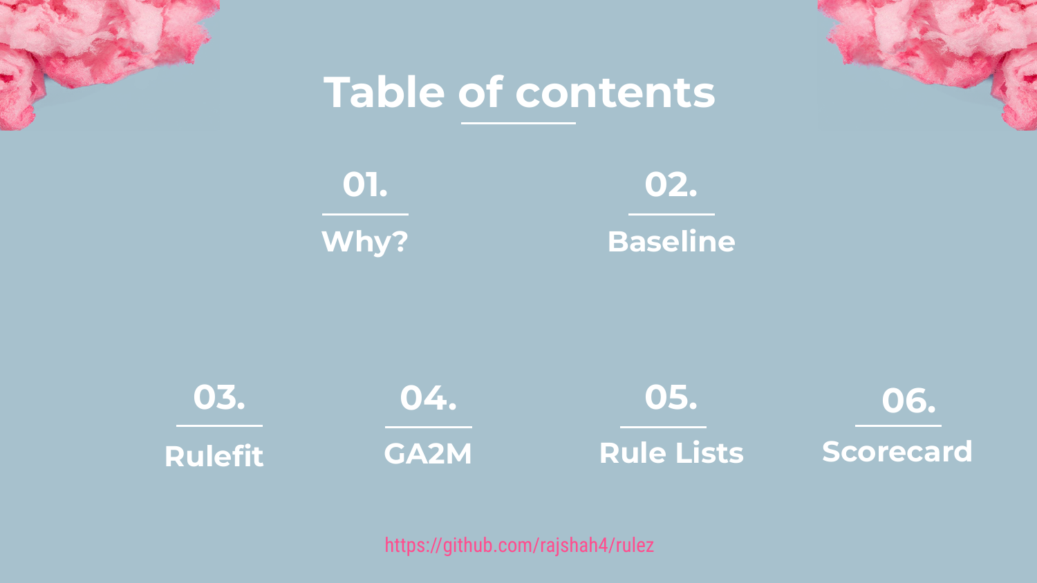
This slide outlines the roadmap for the presentation. Shah explains that he will begin with the “Big Picture” concepts—specifically the “Why?” and the “Baseline”—before diving into four specific technical approaches to rule-based modeling.
The four specific methods to be covered are Rulefit, GA2M (Generalized Additive Models with interactions), Rule Lists, and Scorecards. This structure moves from theoretical justification to practical application, comparing different algorithms that prioritize transparency.
Shah also mentions that a GitHub repository is available with code examples for everything shown, allowing the audience to reproduce the results for the tabular datasets discussed.
3. Section 1: Why?
This section header introduces the fundamental question: Why do we want rules? The speaker moves past the obvious statement that “AI is important” to investigate the influences that drive data scientists toward complex, opaque models.
Shah prepares to discuss the cultural and competitive pressures in data science that prioritize raw accuracy over usability. This section serves as a critique of the “accuracy at all costs” mindset often found in the industry.
4. Mark Cuban Quote
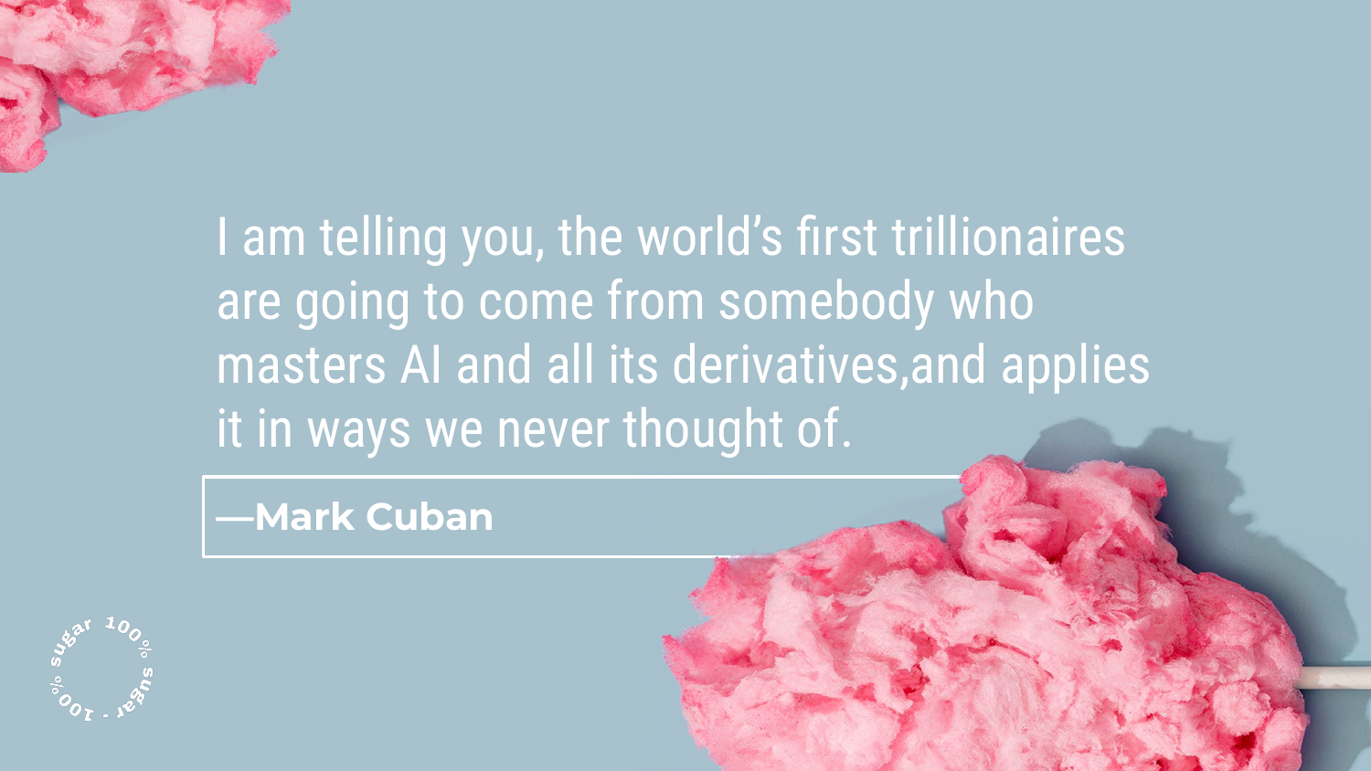
The slide features a quote from Mark Cuban: “Artificial Intelligence, deep learning, machine learning — whatever you’re doing if you don’t understand it — learn it. Because otherwise you’re going to be a dinosaur within 3 years.”
Shah briefly references this as the “obligatory” acknowledgment of AI’s massive importance in the current landscape. It reinforces that while the field is moving fast, the understanding of these systems is paramount, which ties into the presentation’s focus on interpretability.
5. Influences: Kaggle & Academia
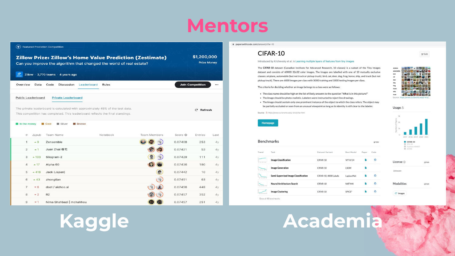
Shah identifies Kaggle competitions and academic research as two primary influences on data scientists. He notes that these platforms heavily incentivize accuracy above all else. For example, in the Zillow Prize, the difference between the top scores is minuscule, yet teams fight for that fraction of a percentage.
He argues that this environment trains data scientists to focus solely on improving metrics (like RMSE or AUC), often ignoring other critical trade-offs like model complexity, deployment difficulty, or explainability.
As he states, “One of the byproducts of Kaggle is a very heavy focus on making sure you improve your models around accuracy… and that’s how you can get a conference paper.” This sets up the problem of complexity creep.
6. The Netflix Prize Winners

This slide shows the winners of the famous Netflix Prize, a competition held about 15 years ago where a team won $1 million for improving Netflix’s recommendation algorithm by 10%.
Shah uses this story to illustrate the peak of the “accuracy” mindset. The competition drew massive interest and drove innovation, but it also encouraged teams to prioritize the leaderboard score over the practicality of the solution.
7. Netflix Prize Progress Graph
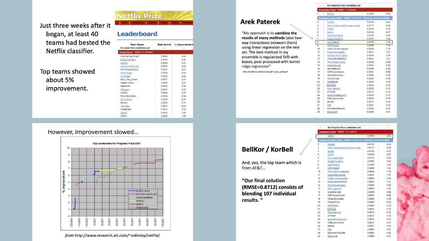
The graph displays the progress of teams over time during the Netflix competition. Shah points out that after an initial period of rapid improvement using standard algorithms, progress plateaued.
To break through these plateaus, teams began using Ensembling—combining multiple models together. The winning solution was an ensemble of 107 different models. Shah emphasizes that while this strategy is powerful for eking out the last bit of performance, it creates immense complexity.
8. The Engineering Cost of Complexity
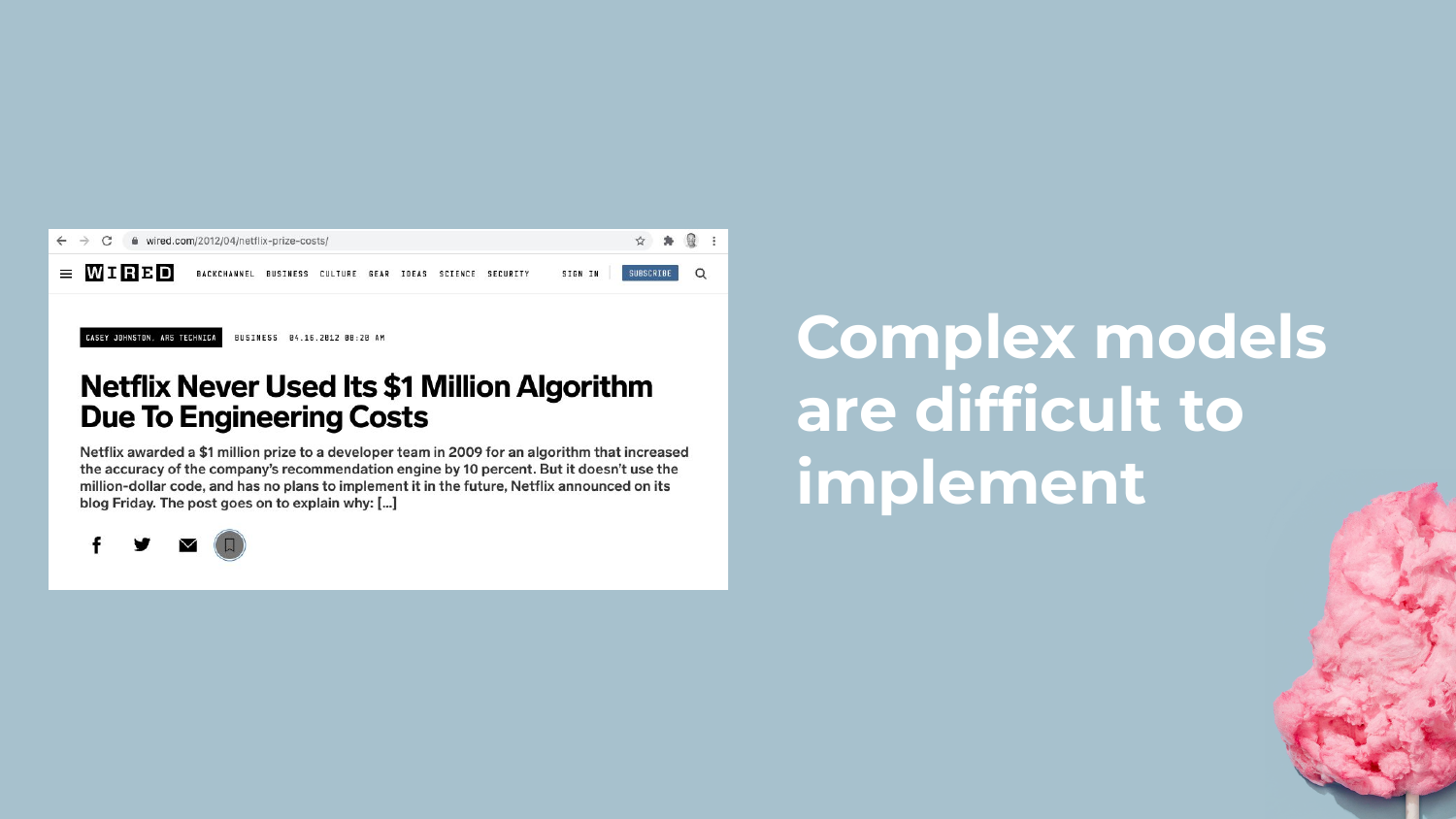
This slide reveals the ironic conclusion of the Netflix Prize: the winning model was never implemented. The engineering costs to deploy an ensemble of 107 models were simply too high compared to the marginal gain in accuracy.
Shah uses this as a cautionary tale: “If your focus is on accuracy… it drives you down towards this complexity… but often you end up with these complex models [that] are often very difficult to implement.” This highlights the disconnect between competitive data science and enterprise reality.
9. Understandable White Box Model (CLEAR-2)
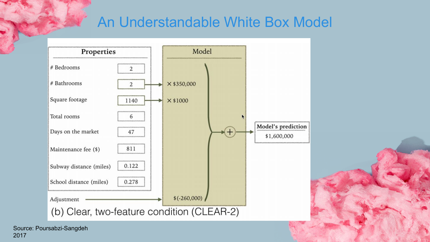
Shah transitions to the alternative: Interpretable Models. This slide shows a simple linear model (CLEAR-2) with only two features. This is a classic “White Box” model where the relationship between inputs and outputs is transparent.
The speaker contrasts this with the “Black Box” nature of complex ensembles. He argues that if you cannot understand what is going on inside a model, you cannot effectively debug it, nor can you easily convince stakeholders to trust it.
10. Complex White Box Model (CLEAR-8)
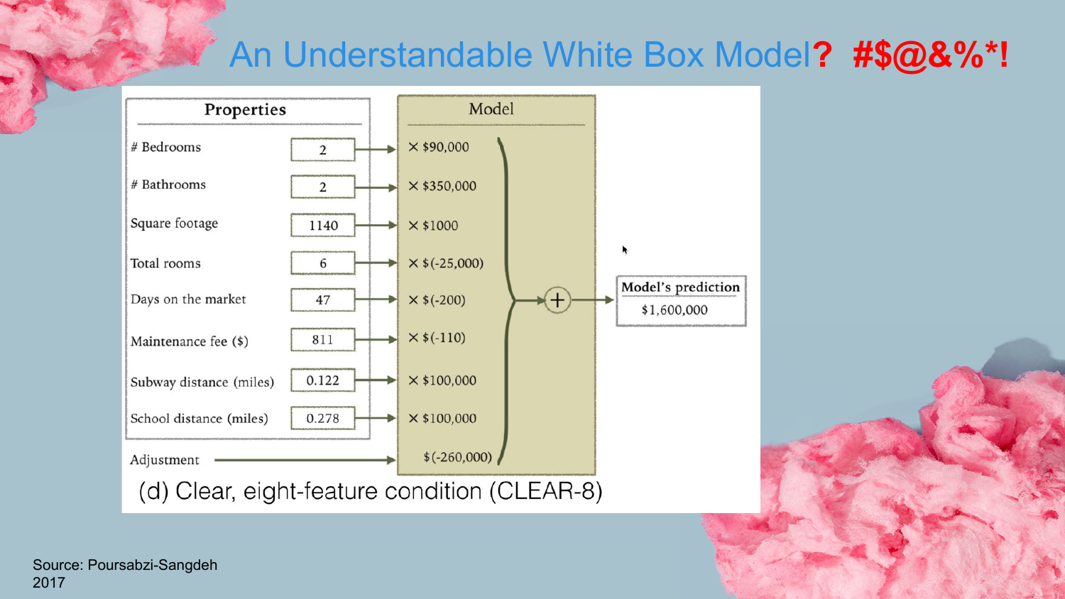
This slide presents a linear model with eight features (CLEAR-8). While technically still a “White Box” model, Shah implies that as feature counts grow, true understandability diminishes.
He touches on this concept later in the “Caveats” section, noting that even linear models can become confusing if there is multicollinearity (features moving in the same direction). Just because we can see the coefficients doesn’t mean the model is intuitively “explainable” to a human if the variables interact in complex, non-obvious ways.
11. Easy to Understand Decision Tree
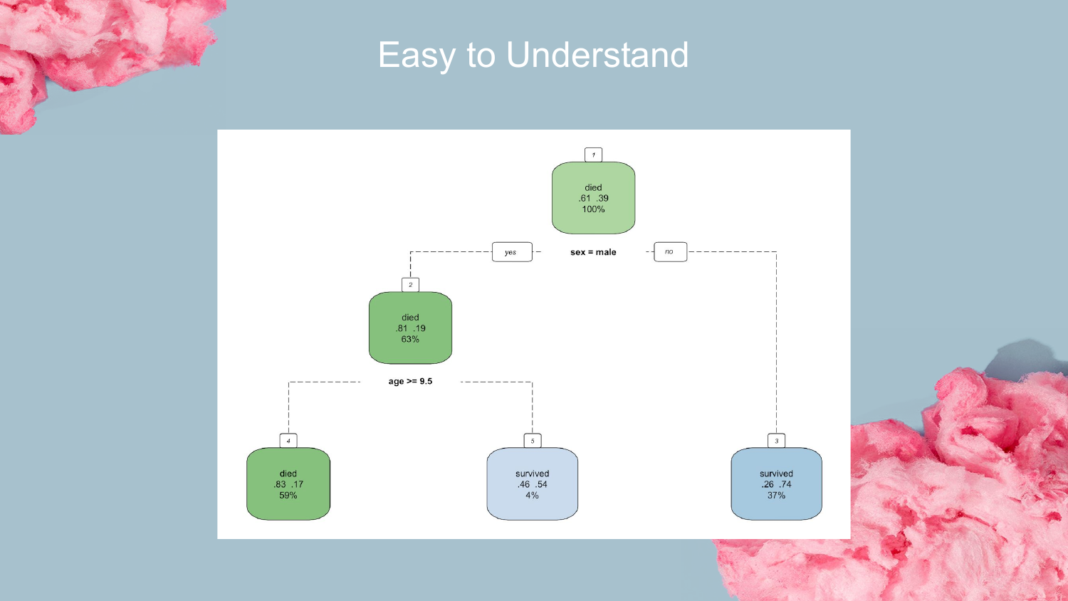
Here, a simple Decision Tree is presented. Shah connects this to the history of rule-based learning, noting that early research found that keeping decision trees “short and stumpy” made them very easy for humans to explain.
This visual represents the ideal of interpretability: a clear path of logic (e.g., “If X is less than 3, go left”) that leads to a prediction. This is the foundation for the Rulefit method discussed later.
12. Too Much to Comprehend
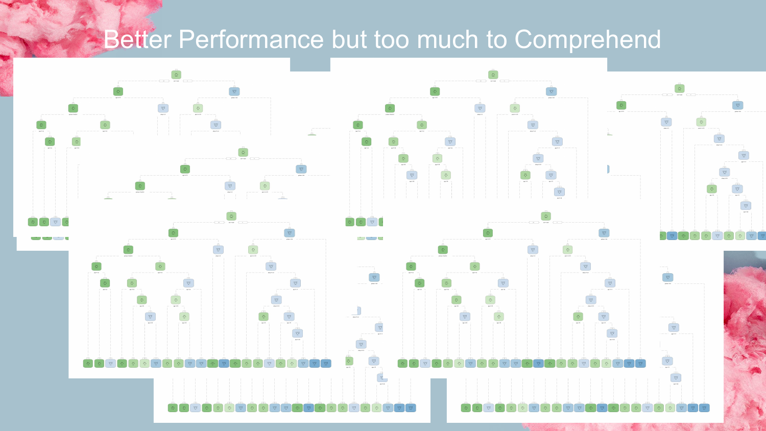
Contrasting the previous slide, this image shows a chaotic forest of decision trees. This represents modern ensemble methods like Random Forests or Gradient Boosted Machines.
Shah uses this visual to reinforce the point that while ensembles offer “Better Performance,” the sheer number of decision paths makes them “too much to Comprehend.” You lose the ability to trace the “why” behind a specific prediction, turning the system into a Black Box.
13. Pedro Domingos Tweet
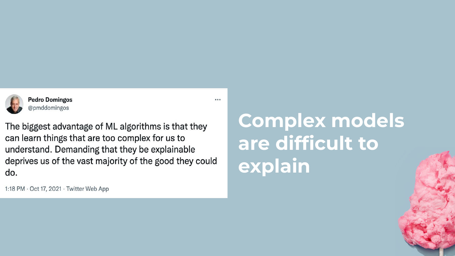
Shah acknowledges the counter-argument by showing a tweet from Pedro Domingos, a prominent machine learning researcher, who suggests that demanding explainability limits the potential of AI.
Shah respectfully disagrees with this stance in the context of enterprise data science. He argues that in the real world, “If you don’t understand what’s going on in your model, it’s hard for you to debug it, it’s hard to convince somebody else to adopt your model.” Practicality and trust often outweigh raw theoretical power.
14. Benefits of Interpretable Models
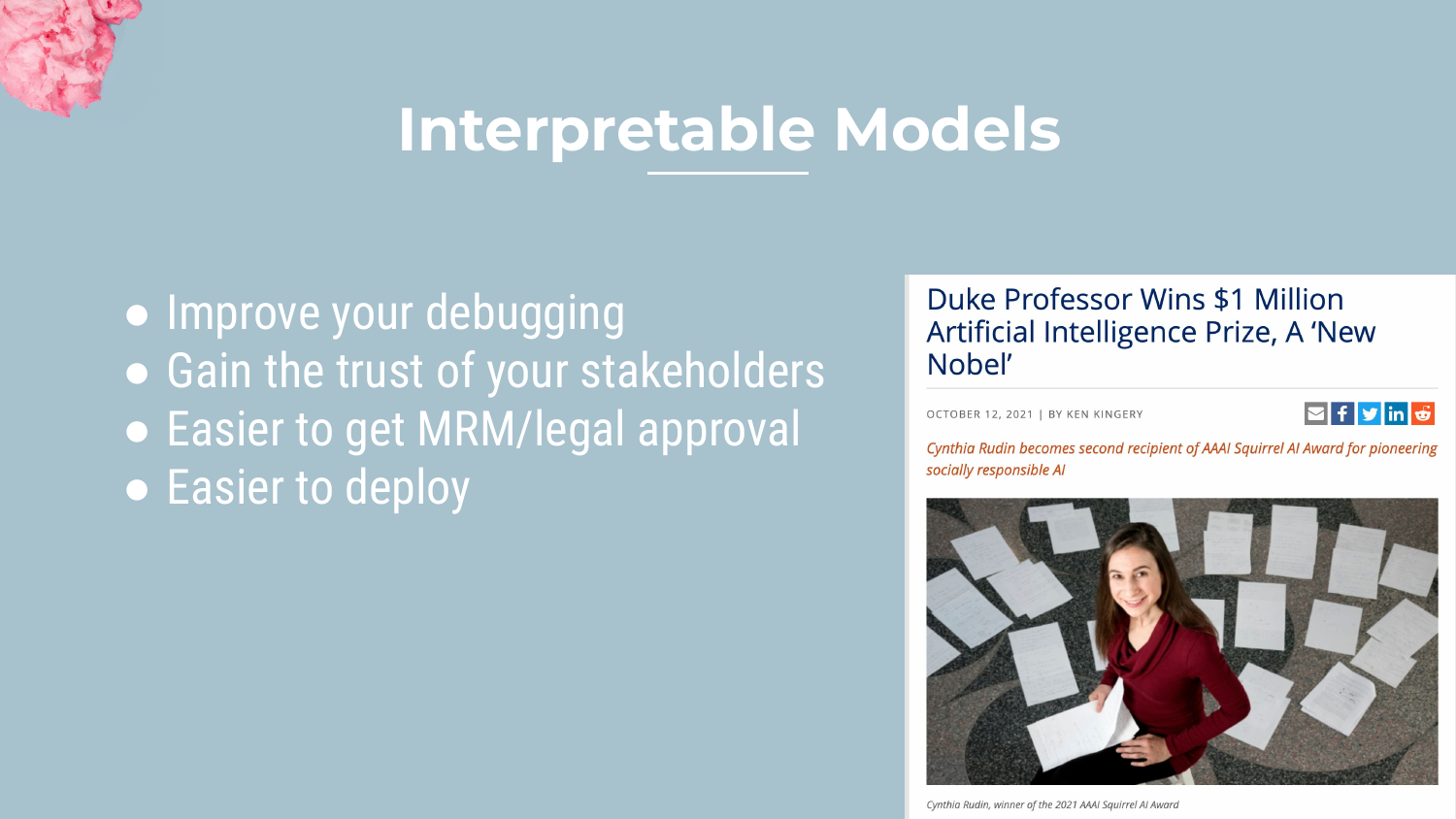
This slide summarizes the key benefits of using interpretable models, referencing the work of Cynthia Rudin. The main advantages are: 1. Debugging: It is easier to spot weird behaviors. 2. Trust: Stakeholders and legal/risk teams are more likely to approve the model. 3. Deployment: These models can often be deployed as simple SQL queries or basic code, avoiding the need for heavy GPU infrastructure.
Shah emphasizes the deployment aspect: “You don’t have to go out and get a GPU… you can actually deploy directly within a database.”
15. Caveats of Interpretable Models
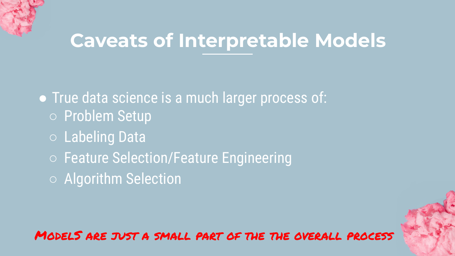
Shah provides a necessary reality check. He clarifies that selecting an interpretable algorithm is only one part of the process. True interpretability depends on the entire data pipeline.
Issues like data labeling, feature engineering, and multicollinearity can render even a simple model confusing. For example, if two correlated features have opposite coefficients in a linear model, it becomes very difficult to explain the logic to a business user, even if the math is simple.
16. Section 2: Baseline

This slide introduces the Baseline section. Shah advocates for always starting a project with a simple baseline model to establish a performance benchmark.
He shares an anecdote about people spending a year on a project only to be nearly matched by a simple model built in two hours. Establishing a baseline helps determine how much effort should be spent chasing incremental accuracy improvements.
17. The Problem: UCI Adult Dataset
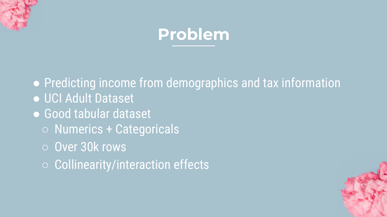
Shah introduces the dataset he will use for all examples in the talk: the UCI Adult Dataset (Census Income). The goal is a binary classification problem: predicting whether someone has a high or low income based on demographics.
He chooses this dataset because it represents typical enterprise tabular data: it has 30,000 rows, a mix of numerical and categorical features, and contains collinearity and interaction effects. This makes it a realistic test bed for the models he will demonstrate.
18. Baseline Models
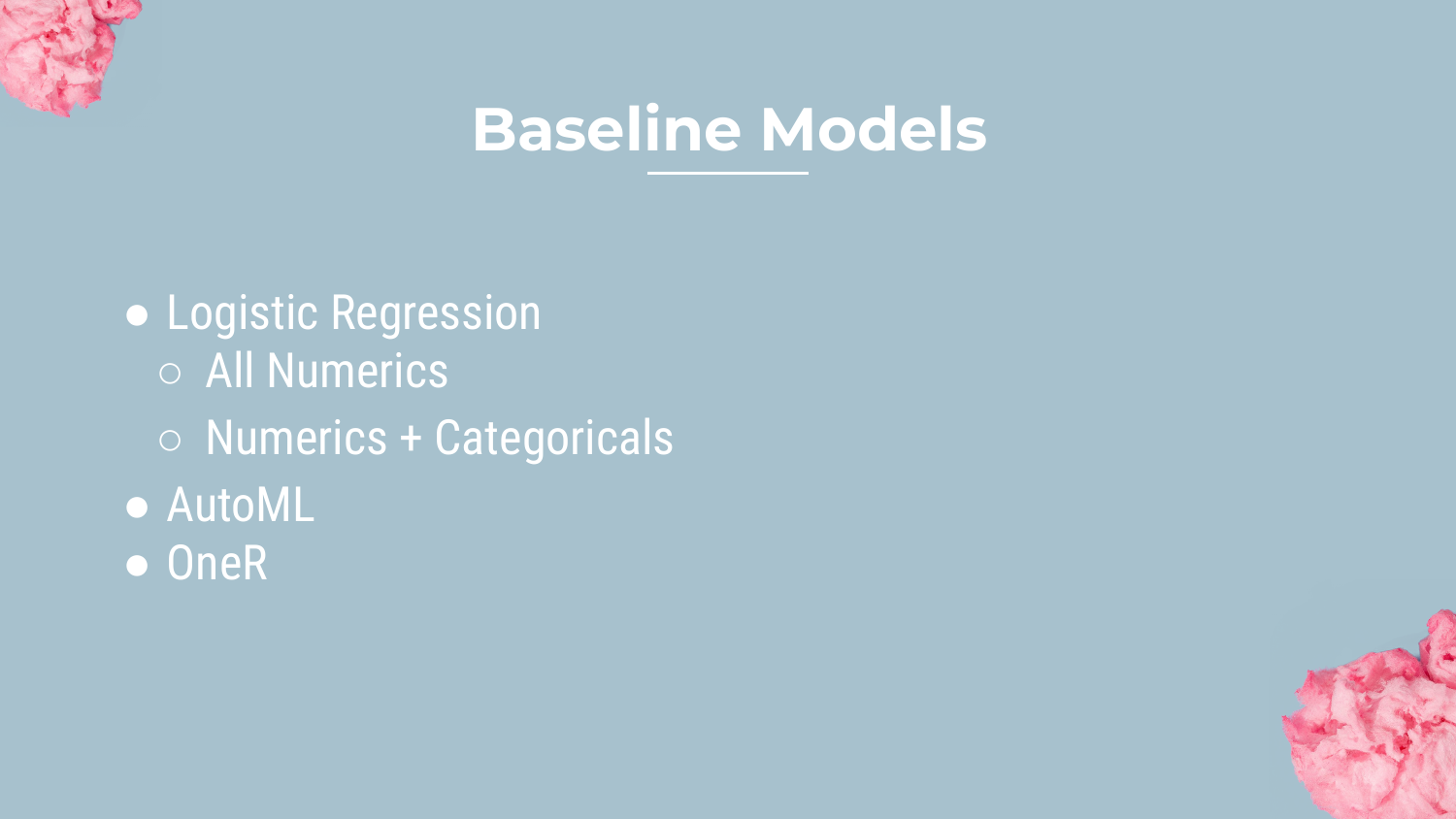
The speaker outlines the three baseline models he built to bracket the performance possibilities: 1. Logistic Regression: The standard statistical approach. 2. AutoML (H2O): A stacked ensemble of many models (Neural Networks, GBMs, etc.) representing the “maximum” possible performance. 3. OneR: A very simple rule-based algorithm.
These baselines provide the context for evaluating the interpretable models later.
19. Baseline Models Plot
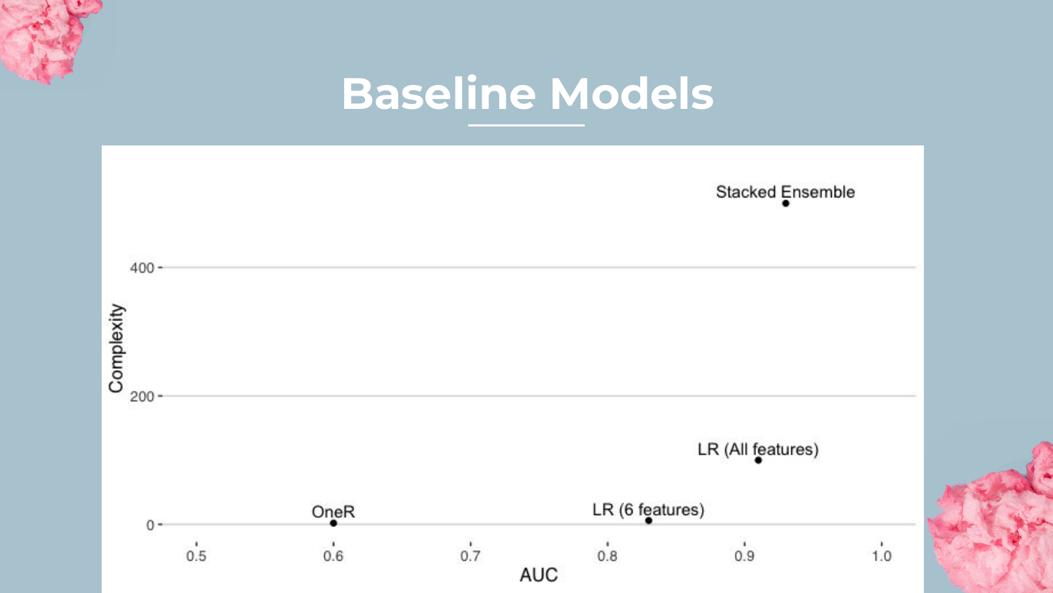
This plot visualizes Complexity vs. AUC (Area Under the Curve). * OneR is at the bottom (AUC ~0.60) with very low complexity. * Logistic Regression is in the middle (AUC ~0.91). * Stacked Ensemble is at the top (AUC ~0.93) but with massive complexity.
Shah notes that while the Stacked Ensemble wins on accuracy, the Logistic Regression is surprisingly close, highlighting that simpler models can often be “good enough.”
20. OneR Example
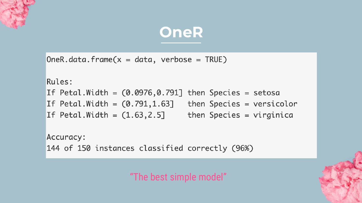
Shah explains the OneR (One Rule) algorithm. This method finds the single feature in the dataset that best predicts the target. In the example shown (Iris dataset), utilizing just “Petal Width” classifies 96% of instances correctly.
He suggests OneR is a great way to detect Target Leakage—if one feature predicts the target perfectly, it might be “cheating.” It also sets the floor for performance; if a complex model can’t beat OneR, something is wrong.
21. Baseline Models Plot (Recap)

Returning to the complexity plot, Shah reiterates the performance gap. The AutoML model sets the “ceiling” at 0.93 AUC.
The goal for the rest of the presentation is to see where the interpretable models (Rulefit, GA2M, etc.) fall on this graph. Can they approach the 0.93 AUC of the ensemble without incurring the massive complexity penalty?
22. Section 3: Rulefit

This slide introduces the first major interpretable technique: Rulefit. Shah mentions familiarity with this from his time at Data Robot and notes that it is a powerful way to combine the benefits of trees and linear models.
23. What is Rulefit?
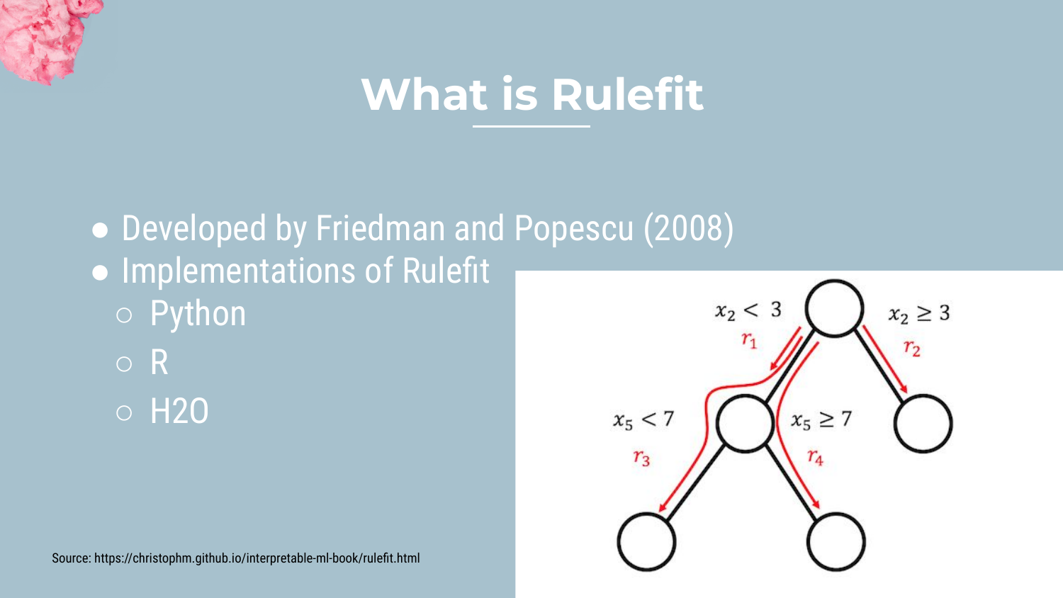
Rulefit is an algorithm developed by Friedman and Popescu (2008). It works by: 1. Building a random forest of short, “stumpy” decision trees. 2. Extracting each path through the trees as a “Rule.” 3. Using these rules as binary features in a sparse linear model (Lasso).
This approach allows the model to capture interactions (via the trees) while maintaining the interpretability of a linear equation.
24. H2O Rulefit Output
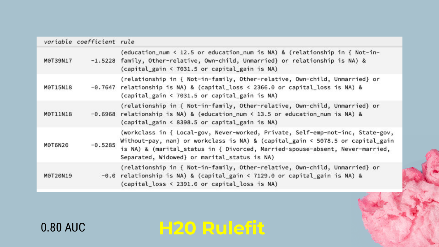
Shah displays the output from the H2O Rulefit implementation. The model generates human-readable rules, such as: “If Education < 12 AND Capital Gain < $7000, THEN Coefficient is negative.”
He notes that while the rules are readable, the raw output can look like “computer-ese.” However, it allows a data scientist to identify specific segments of the population (e.g., low education, low capital gain) that strongly drive the prediction.
25. Overlapping Rules

A key characteristic of Rulefit is that the rules overlap. A single data point might satisfy multiple rules simultaneously.
Shah points out that this adds a layer of complexity to interpretability. To understand a prediction, you have to sum up the coefficients of all the rules that apply to that person. This is different from a decision tree where you fall into exactly one leaf node.
26. H2O Rulefit with Linear Terms
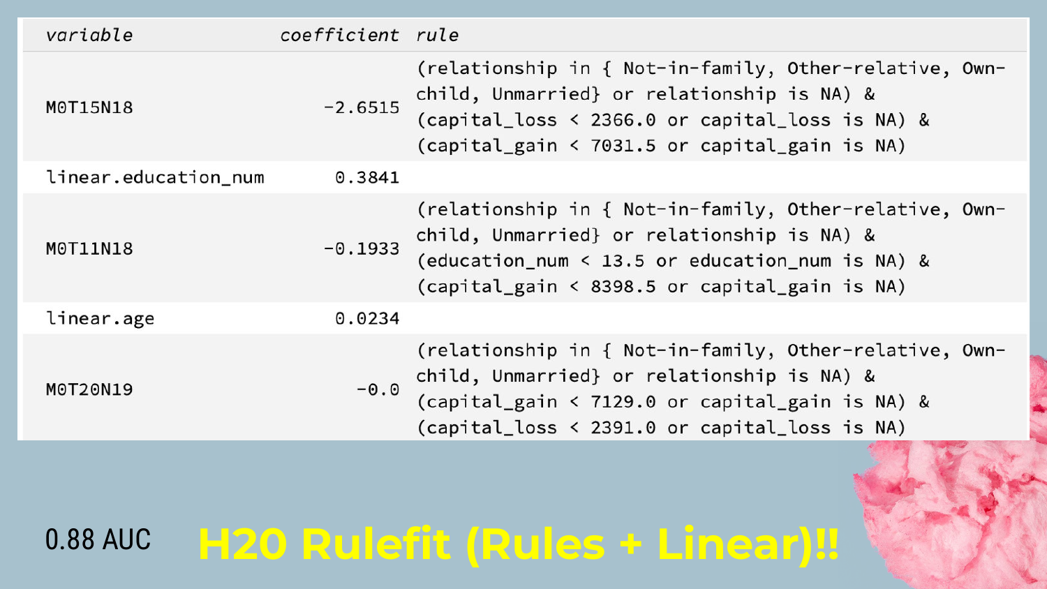
One limitation of pure rules is handling continuous variables (like age or miles driven). Rules have to “bin” these variables (e.g., Age < 30, Age 30-40).
Shah explains that H2O Rulefit solves this by including Linear Terms. The model can use rules for non-linear interactions and standard linear coefficients for continuous trends. This hybrid approach boosts the AUC significantly (up to 0.88 in this example) by capturing linear relationships more naturally.
27. Rulefit Results
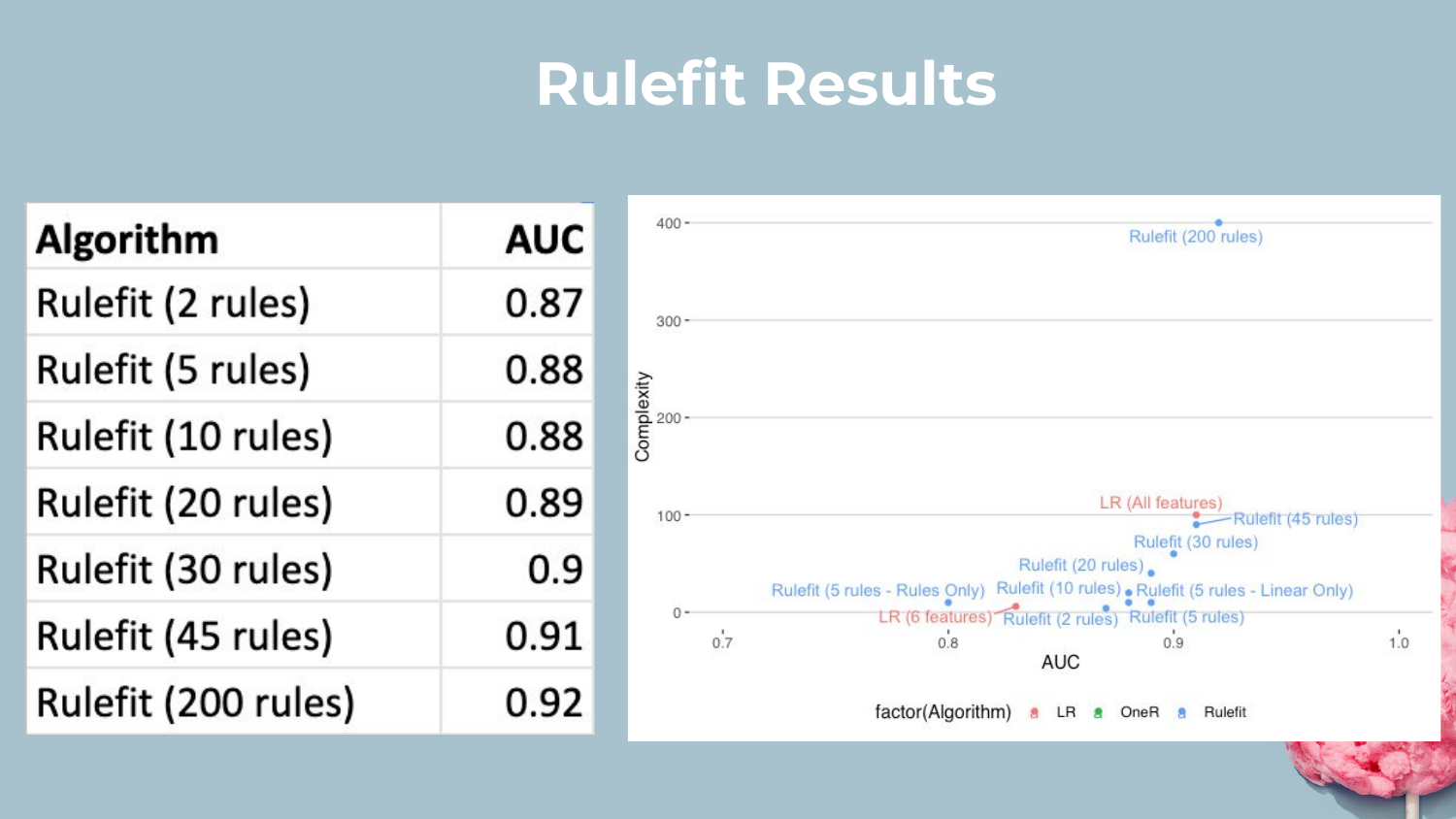
This slide plots the performance of Rulefit models with varying numbers of rules. Shah demonstrates that by increasing the number of rules (complexity), the AUC climbs closer to the Stacked Ensemble.
He concludes that Rulefit is a versatile tool. You can tune the “dial” of complexity: fewer rules for more interpretability, or more rules for higher accuracy, often getting very competitive performance.
28. Section 4: GA2M

The presentation moves to the second technique: GA2M (Generalized Additive Models with pairwise interactions). Shah notes that while GAMs have existed for a while, modern implementations like Microsoft’s Explainable Boosting Machines (EBM) have made them much more accessible and powerful.
29. What is GA2M?
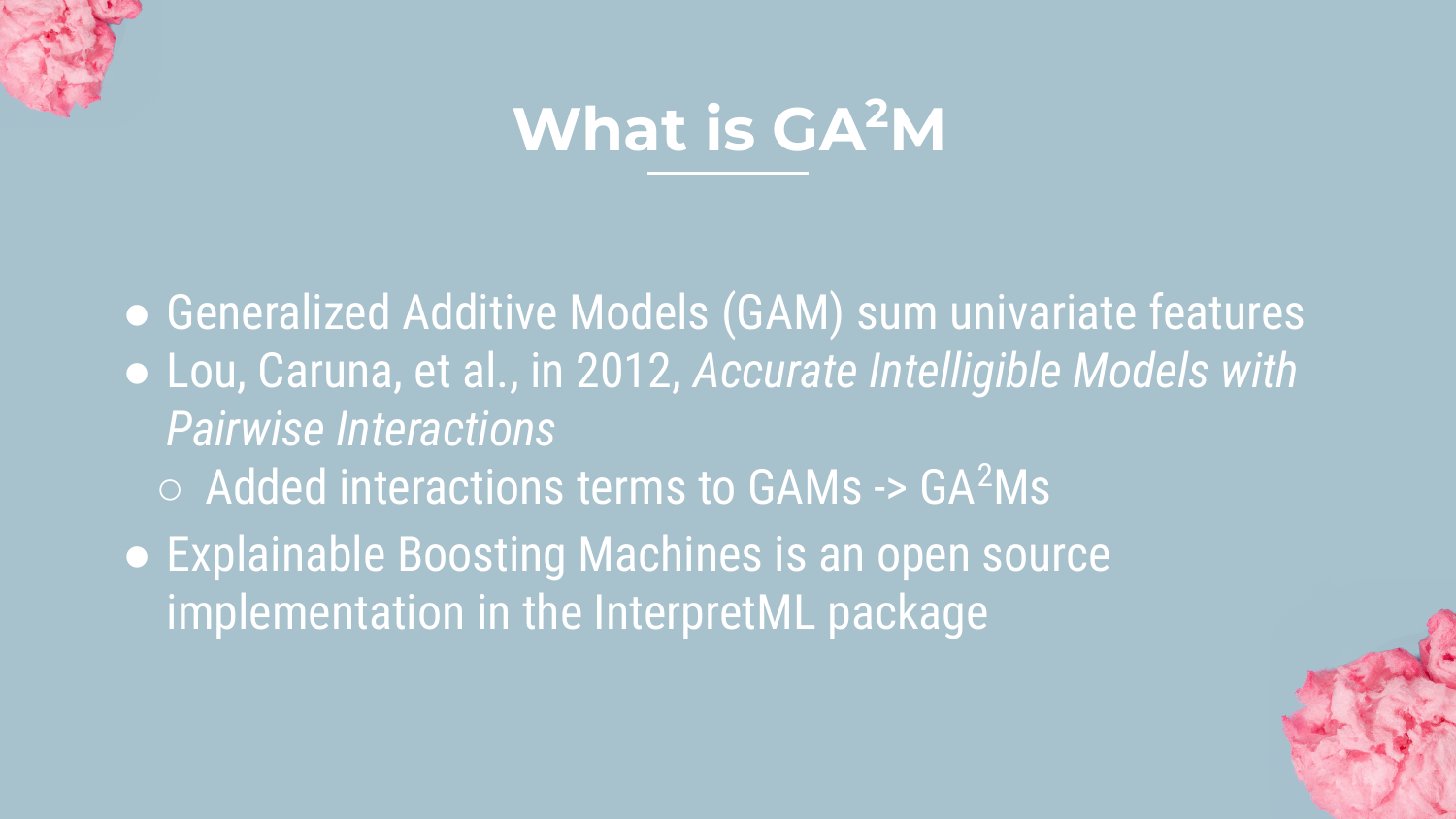
GA2M is essentially a linear model where features are binned, and pairwise interactions are automatically detected. Shah highlights InterpretML, an open-source library from Microsoft that implements this via EBMs.
The model structure is additive: \(g(E[y]) = \beta_0 + \sum f_j(x_j) + \sum f_{ij}(x_i, x_j)\). This means the final score is just the sum of individual feature scores and interaction scores, making it very transparent.
30. GA2M Binning
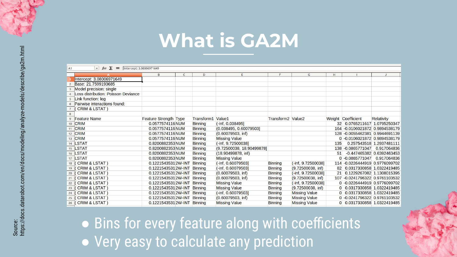
Shah explains how GA2M handles numerical data. Instead of a single slope coefficient (like in logistic regression), the model bins the continuous feature (e.g., dividing “criminal history” into ranges).
Each bin gets its own coefficient. This allows the model to learn non-linear patterns (e.g., risk might go up, then down, then up again as a variable increases) while remaining easy to inspect.
31. Interactions in GA2M
The “2” in GA2M stands for pairwise interactions. Shah emphasizes that this is the model’s superpower. While standard linear models struggle with interactions (e.g., the combined effect of age and education), GA2M has an efficient algorithm to automatically find the most important pairs.
This allows the model to achieve accuracy levels comparable to complex ensembles (AUC 0.93) because it captures the interaction signal that simple linear models miss.
32. GA2M Visualization
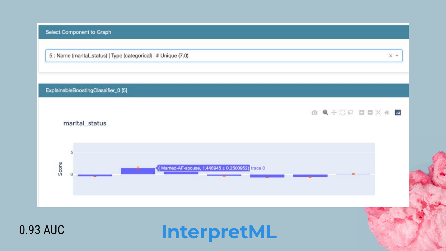
Shah showcases the InterpretML dashboard. It provides clear visualizations of how each feature contributes to the prediction.
In the example, we see the coefficients for different marital statuses. This acts like a “lookup table” for risk. Shah argues that this is very “model risk management friendly” because stakeholders can validate every single coefficient and interaction term to ensure they make business sense.
33. Section 5: Rule Lists

The third approach is Rule Lists. Shah introduces this as a method to solve the “overlapping rules” problem found in Rulefit.
34. What are Rule Lists?
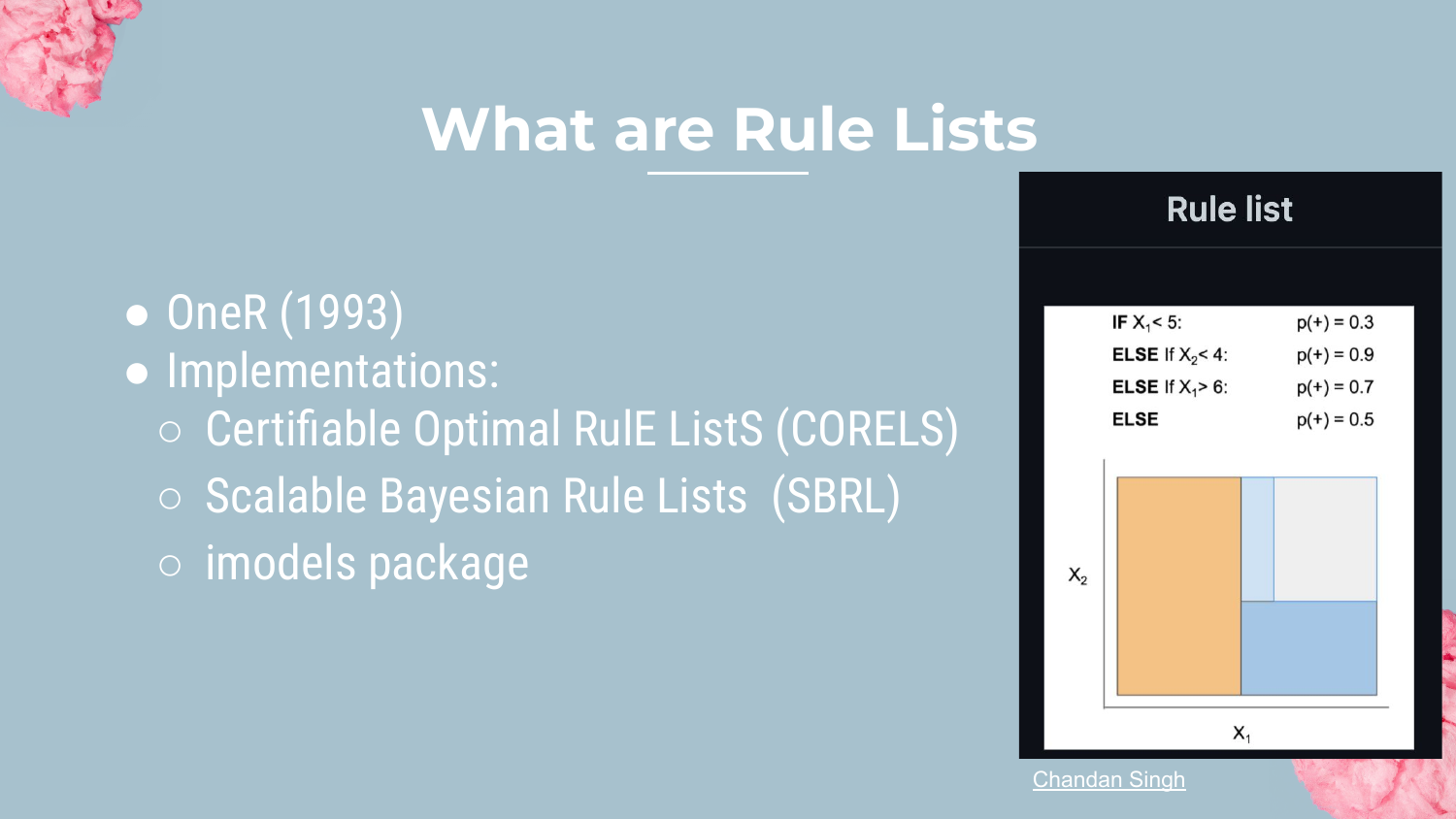
Rule Lists are ordered sets of IF-THEN-ELSE statements. Unlike Rulefit, where you sum up multiple rules, here an observation triggers only the first rule it matches.
Shah mentions implementations like CORELS and SBRL (Scalable Bayesian Rule Lists). The goal is to produce a concise list that a human can read from top to bottom to make a decision.
35. SBRL Process

Creating an optimal rule list is computationally expensive because the algorithm must search through many permutations to find the best order.
Shah explains the logic: The algorithm finds a rule that covers a subset of data, removes those instances, and then finds the next rule for the remaining data. This sequential “peeling off” of data creates the IF-ELSE structure.
36. SBRL Output Example
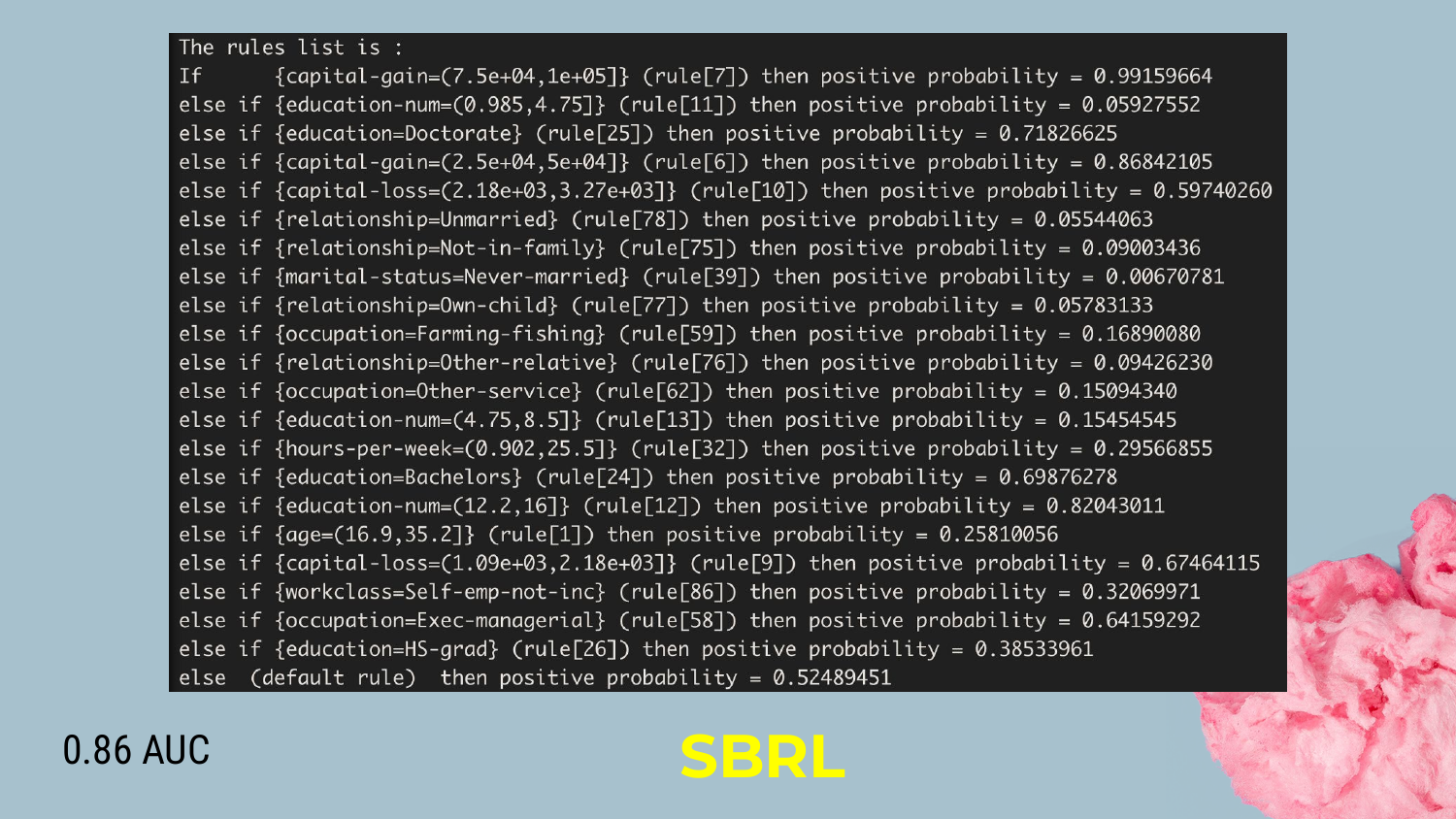
The output of an SBRL model is shown. It reads like a checklist: 1. IF Capital Gain > $7500 -> High Income (99% prob) 2. ELSE IF Education < 4 -> Low Income (90% prob) 3. ELSE…
Shah highlights the simplicity: “You just go down the list until you find the rule… much easier to explain to those marketing people.” The trade-off is a drop in accuracy (AUC 0.86) compared to GA2M or Rulefit.
37. Section 6: Scorecard

The final approach is the Scorecard. Shah introduces this as perhaps the simplest and most widely recognized format for decision-making in industries like credit and criminal justice.
38. What are Scorecards?
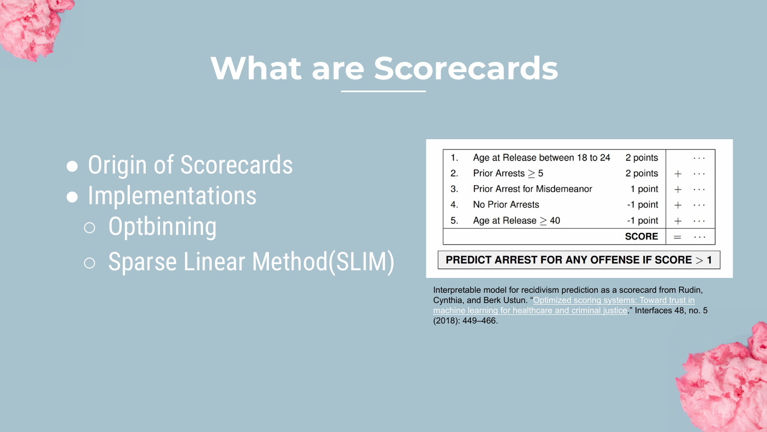
Scorecards are simple additive models where features are assigned integer “points.” To get a prediction, you simply add up the points.
Shah mentions tools like Optbinning and SLIM (Sparse Linear Integer Models). This format is beloved in operations because it can be printed on a physical card or implemented in a basic spreadsheet.
39. Scorecard Example
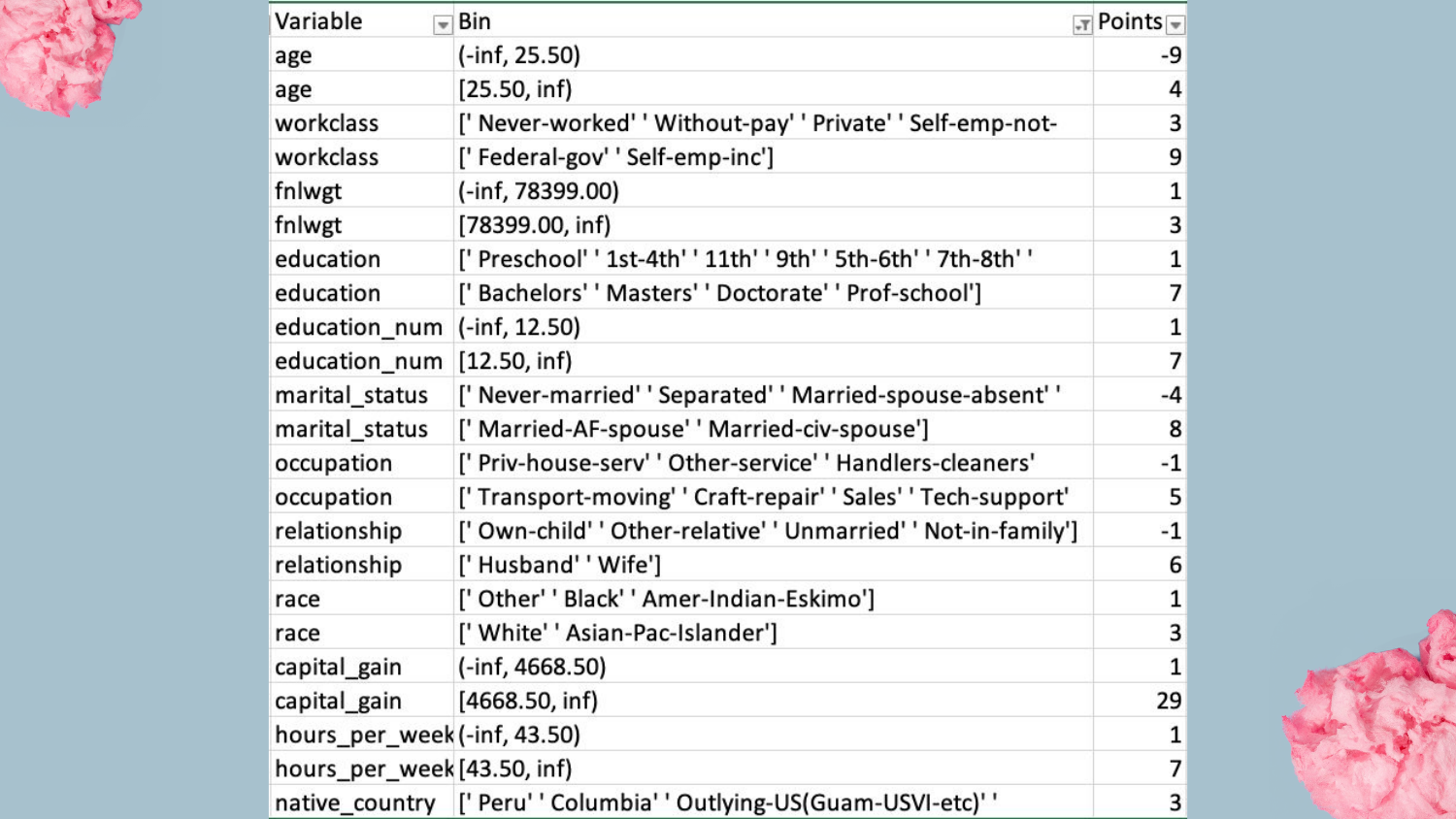
This slide shows a scorecard built for the Adult dataset. * Capital Gain > 7000? +29 points. * Age < 25? -5 points.
Shah expresses a personal preference for this over raw coefficients: “I actually like this better… I think it’s a little easier to understand which features are most important.” The integer points make the “weight” of each factor immediately obvious to a layperson.
40. Summary

Shah begins to wrap up the presentation, preparing to consolidate the four methods (Rulefit, GA2M, Rule Lists, Scorecards) into a final comparison.
41. Complexity vs AUC Summary Plot
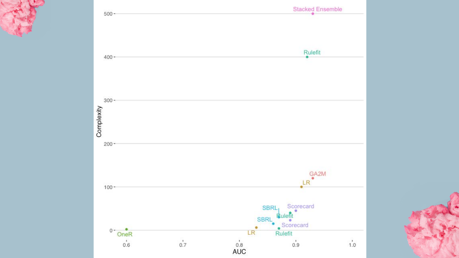
This is the definitive comparison graph of the talk. It places all discussed models on the Complexity vs. AUC plane. * GA2M (EBM) and Rulefit sit high up, offering near-SOTA accuracy with moderate interpretability. * Scorecards and Rule Lists sit lower on accuracy but offer maximum simplicity.
Shah summarizes the trade-off: “The Rule Lists and Scorecard… you lose a little bit [of accuracy]… but we talked about the trade-offs of being able to easily understand.”
42. Take Away
The final message is a call to action: Try these approaches.
Shah encourages data scientists to add these tools to their toolkit. He asks them to consider the specific needs of their problem: Is it about transparency in calculation (Scorecard)? Or understanding factors (GA2M)? Often, a simple model that gets deployed is far better than a complex model that gets stuck in review.
43. Conclusion

The presentation concludes with Rajiv Shah’s contact information. He mentions an upcoming blog post that will synthesize these topics and invites the audience to reach out with questions or feedback.
He reiterates that these interpretable models are often easier to get “buy-in” for, making them a pragmatic choice for real-world data science success.
This annotated presentation was generated from the talk using AI-assisted tools. Each slide includes timestamps and detailed explanations.